July 17 was “World Emoji Day,” an observance named for the fact that the 📅 (calendar) emoji displays the date July 17 (worldemojiday.com). To mark the occasion, Google published “Designing emoji for the way we communicate today,” an article explaining the design thinking behind its new emoji set “Noto 3D.” Noto 3D itself was already announced in a May 12, 2026 article; this new piece is a follow-up that digs into the design decisions and the release policy.
In this article, we first show the actual new 3D emoji, confirm how they are made, and then work through the substance of the announcement alongside its original text.
First, the real thing — Noto 3D emoji
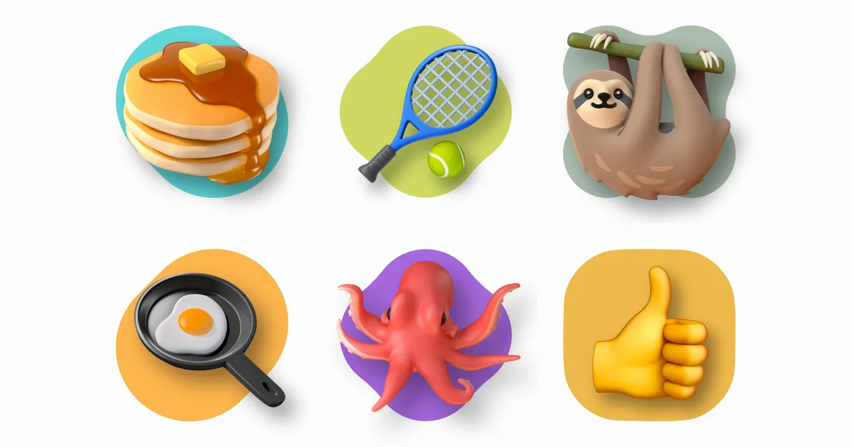
From the promotional footage included in the announcement, we cut out six of the new emoji. In order, from the top left: 🥞 (pancakes), 🎾 (tennis), 🦥 (sloth), 🍳 (fried egg), 🐙 (octopus), and 👍 (thumbs up).
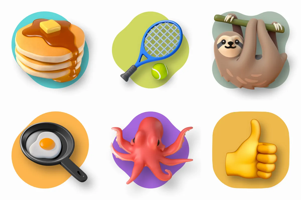
▲ Noto 3D emoji. Source: cut from the promotional footage in Designing emoji for the way we communicate today — Google
From the rounded corners of the butter to the tension of the racket’s strings to the sloth’s fur, each is drawn as a solid form with texture and shading. At the same time, as discussed below, they do not go all the way to photorealism; the forms are soft, closer to clay figures or plush toys. The way they are drawn has changed fundamentally from the flat 2D illustrations of the current Noto Color Emoji.
How it’s done — from 2D drawings to “true 3D models”
That same promotional footage also shows how this three-dimensionality is achieved. Using 👍 as an example, it places side by side the conventional flat 2D illustration (left), the wireframe of the 3D model (center), and the rendered Noto 3D emoji (right).
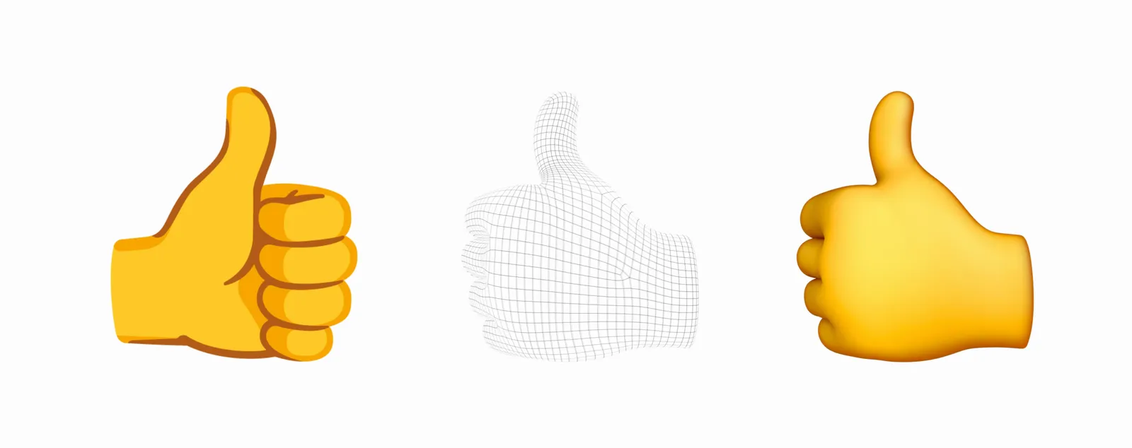
▲ Left: the conventional flat design; center: the wireframe of the 3D model; right: Noto 3D. Source: cut from the promotional footage in the same article (Google)
In other words, the new emoji are not drawings redrawn to look three-dimensional; they are actual 3D models that have been built and rendered. The article, too, notes that the process still starts with 2D drawings as before, and states:
While our design process still begins with 2D drawings, it no longer ends there. In an industry first, Noto Emoji 3D is entirely available as true 3D models.
(While the design process still begins with 2D drawings, it no longer ends there. In an industry first, the whole of Noto Emoji 3D is available as true 3D models.)
In the process of lifting a flat drawing into three dimensions, the article writes, they had to answer questions that did not exist in the 2D era — “what is the back of a smiley’s head? A concave mask, a bouncy solid ball, or a flat sheet of paper?” And it states that this model data itself will be released.
Because language is meant to be shared, our entire Noto portfolio is completely open source. We’re handing over raw .OBJ files to the community so they can use them to build immersive VR worlds, indie apps or weird memes.
(Because language is meant to be shared, the entire Noto portfolio is completely open source. We are handing the raw .OBJ files to the community, so they can build immersive VR worlds, indie apps, or weird memes as they like.)
.OBJ is a text-based file format that describes the geometry of a 3D model (vertices, faces, and so on) and is widely used to exchange data between 3D authoring tools (Wavefront OBJ File Format — Library of Congress). Previous Noto emoji releases were fonts and SVG/PNG images — that is, forms meant to “display characters” — whereas what is said to be released this time is the model data itself. What differs from before is that it can be brought directly outside of message display, into 3D spaces, in-app effects, and the like.
Note that the specific distribution URL was not given in the body of the announcement as of July 18, 2026. We also checked the googlefonts/noto-emoji repository on GitHub — the conventional release location — on the same day, but found no mention of 3D models in the repository’s top-level structure or its README.
The core of the announcement
Including what we have seen so far, the July 17 article can be summarized in these five points:
- Redesigned all 3,977 characters of the emoji library in 3D
- Production still starts with 2D drawings as before, but the final deliverable is a “true 3D model” (Google claims this is an “industry first”)
- Declared that the Noto portfolio is open source and that it will release the 3D models’ .OBJ files to the community
- Built an AI-powered contrast-checking tool to address visibility problems in dark mode
- Rollout in the latter half of 2026, starting with Pixel (from the May first report)
Below, we go through the remaining points alongside the original text.
The motivation for the redesign — usage shifted toward “exaggeration”
As the background to the redesign, Google cites a change in how emoji themselves are used — the fall of 😂 (face with tears of joy), long the most frequently used — with statistics from its keyboard app as the basis.
For years, “face with tears of joy” (😂) was the undisputed emoji king, according to Gboard Federated Analytics. But following a multi-year decline, it slipped down the charts by 2025. Why? Because 😭 is a masterclass in modern vocabulary: It’s hilarious, it’s devastating and it captures absolute overwhelm. When we do laugh, our inclination for hyperbole demands it be unhinged, pushing “rolling on the floor laughing” (🤣) to the top of the chart.
(According to Gboard Federated Analytics, "face with tears of joy" (😂) was for years the undisputed king of emoji. But after a multi-year decline, it had slipped down the charts by 2025. Why? Because 😭 is a masterclass in modern vocabulary: it is hilarious, it is devastating, and it captures absolute overwhelm. And when we do laugh, our inclination toward hyperbole demands that the laughter be unhinged, pushing "rolling on the floor laughing" (🤣) to the top of the chart.)
It goes on to cite data showing that the expression of heartbreak, too, is shifting in popularity from 💔 (broken heart) to 🥀 (wilted flower). The cited basis, “Gboard Federated Analytics,” is a mechanism that aggregates usage statistics for Google’s keyboard app Gboard on the device side without collecting individual input data (Federated Analytics — Google Research).
Design policy — expression, not photorealism
As we saw in the real examples at the outset, the forms remain soft even in three dimensions. This is a stated policy: they do not move toward photorealism.
Our emoji have always favored expression over hyper-realism and in this new 3D world it means our designs can have dimension without being photorealistic. They need a pulse and a soul — not the cold precision of industrial CAD models.
(Our emoji have always favored expression over hyper-realism, and in this new 3D world that means our designs can have dimension without being photorealistic. What they need is a pulse and a soul — not the cold precision of industrial CAD models.)
The article gives the kangaroo as an example. There is no need to faithfully reproduce a real kangaroo; it is enough to capture a “kangaroo-like playfulness” through the power of illustration. The endearing form of the 🦥 at the outset, far removed from a real sloth, can be seen as an example of this policy.
It also states that it verified the effect of emoji changes on communication through a large-scale user study, citing the following findings:
The research unmasked universal truths: Users overwhelmingly prefer full-body animals over floating heads; adding props hurts comprehension; and tiny tweaks (like swapping the direction of a wink) can turn mild confusion into accidental outrage.
(The research revealed universal truths: users overwhelmingly prefer full-body animals over floating heads; adding props hurts comprehension; and tiny tweaks — like swapping the direction of a wink — can turn mild confusion into accidental outrage.)
The second finding — that adding props makes things harder to understand — makes sense given that emoji are symbols displayed at a few dozen pixels square. The third is an example showing that a trivial difference in an emoji’s appearance can change the interpretation of its meaning — that emoji are read not as mere pictures but as vocabulary.
Accessibility — AI-based contrast checking
In improving visibility, the use of AI is concrete. The announcement includes, using 👍🏿 as an example, a diagram analyzing the division of roles among colors: skin tone, shading, and rim light.
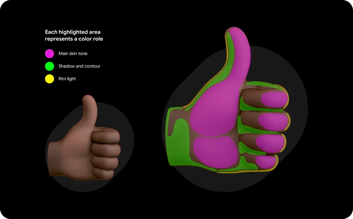
▲ An analysis diagram of the roles of the colors (skin tone, shading, rim light). Source: the same article (Google)
Emoji with the darkest skin tones can be difficult to see in dark mode — a problem for anyone who sends or receives them. That’s why we built an AI-powered contrast tool that analyzes each emoji at the pixel level, flags when the contrast ratio is too low and suggests high-contrast solutions that are implemented by designers 💪💪🏻💪🏼💪🏽💪🏾💪🏿.
(Emoji with the darkest skin tones can be difficult to see in dark mode — a problem for the sender and the receiver alike. That is why we built an AI tool that analyzes each emoji at the pixel level, flags when the contrast ratio is too low, and suggests high-contrast solutions; the implementation is done by designers 💪💪🏻💪🏼💪🏽💪🏾💪🏿.)
Contrast ratio is the ratio of the relative luminance of foreground to background, as defined in WCAG, the web accessibility guidelines (WCAG 2.1 — contrast ratio). The fact that the tool handles the judgment and the presentation of alternatives, while designers decide whether to adopt them and carry out the implementation, can be read as one concrete example of introducing AI into the design process.
Checking “3,977 characters” against Unicode’s official count
Google puts the target at “all 3,977 characters.” On the other hand, when we checked the Unicode Consortium’s official count page “Emoji Counts, v17.0” on July 18, 2026, the total as of Emoji 17.0 was 3,953, of which 1,388 were base emoji and the rest were variations such as skin tones.
In other words, Google’s figure is 24 more than Unicode’s official count. The “number” of emoji varies depending on the unit by which one counts skin-tone and gender variations and flags, and Unicode’s own count table separates base emoji from variations. There is no explanation in the article of what range Google’s figure of 3,977 counts, and the breakdown of the difference of 24 could not be confirmed as of July 18, 2026.
Placement within the lineage, and the mechanism by which it reaches the device in your hand
The explainer article on the emoji information site Emojipedia positions this overhaul as the “fifth major era” of Google emoji. By that article’s account, it starts with the black-and-white designs of the early 2010s, moves through the round “blob” characters that took hold in the mid-2010s, the gradient shading introduced with Android 8.0 in 2017, and the current flat Noto Color Emoji introduced with Android 11.0 in 2020, arriving now at Noto 3D. Google itself referred to this lineage in its May first report, describing it as going “from the lovable, innocent blob emoji of the 2010s to Noto 3D.”
Such a wholesale overhaul is possible because emoji are displayed through a division of labor between “character code” and “glyph.” What a document or message holds is only the Unicode character code; the visible appearance as a picture is supplied by the emoji font on the device side — on Android and ChromeOS, Noto Color Emoji. The Unicode Consortium only defines characters and does not manage glyphs; design is left to each platform vendor (Emoji and Pictographs FAQ — Unicode). Therefore, if the font on the device is replaced, the appearance changes all at once — including the 😂 sent in the past — without a single character of the text data changing.
As for the rollout timing, the May first report says, “Noto 3D will be available across Google, starting with Pixel phones, later this year.” The July 17 article gives no new information on timing.
Summary
- Noto 3D is a new emoji set in which Google redesigned all 3,977 characters of the emoji library in 3D. It is three-dimensional but does not go toward photorealism, unified with soft, clay-figure-like forms.
- The method of realization is not “redrawing to look three-dimensional” but building actual 3D models from a starting point of 2D drawings and rendering them. Google positions this as “the industry’s first emoji available in their entirety as true 3D models.”
- It declared that it will release the 3D models’ .OBJ files as open source. However, the specific distribution URL could not be confirmed, as of July 18, 2026, in either the announcement or the noto-emoji repository on GitHub.
- The motivation for the redesign lies in the change in usage. On the basis of Gboard statistics, it cites the fall of 😂 from the top and the rise of 🤣, the shift from 💔 to 🥀, and other signs that expression is leaning in the direction of exaggeration.
- From a user study it presents the findings that “full-body animals are preferred,” “props hinder comprehension,” and “trivial changes like the direction of a wink create misunderstanding,” and it verified dark-mode visibility with an AI-based contrast check.
- Google’s figure of 3,977 characters is 24 more than Unicode’s official count (3,953 in Emoji 17.0). There is no explanation of the counting range in the article, and the breakdown of the difference could not be confirmed.
- Because the glyphs of emoji are supplied by the font on the device side, replacing the font changes the appearance while the character data stays the same. Rollout is in the latter half of 2026, starting with Pixel phones (from the May first report).
References
- Designing emoji for the way we communicate today — Google (published July 17, 2026. The main source for this article. The figures of 3D emoji in the body are quoted from the promotional footage and images in this article.)
- Express yourself with our new 3D emoji. — Google (the first report, published May 12, 2026. Source for the rollout timing.)
- Emoji Counts, v17.0 — Unicode (accessed July 18, 2026)
- Emoji and Pictographs FAQ — Unicode (source for the fact that glyphs are provided by each platform vendor and are not managed by Unicode)
- googlefonts/noto-emoji — GitHub (the release location for the conventional Noto emoji. Open Font License 1.1; source for use on Android and ChromeOS)
- World Emoji Day (the origin of July 17)
- Google’s 3D Emoji Overhaul: What, When & How Does It Compare — Emojipedia (an account of the design lineage)
- Federated Analytics: Collaborative Data Science without Data Collection — Google Research
- Wavefront OBJ File Format — Library of Congress
- WCAG 2.1 — Web Content Accessibility Guidelines (definition of contrast ratio) — W3C